A Geospatial Analysis on Food Deserts in South Central Los Angeles
Introduction
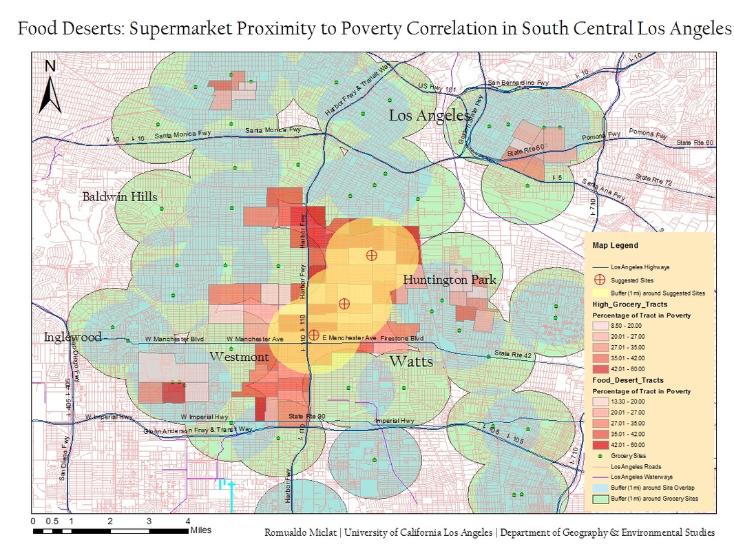
In many situations, issues of social injustice could only be recognized through spatial analysis. A particular issue rising among households in the lower-class districts of Los Angeles is the notion of ‘food deserts’. This phenomenon occurs when there are impoverished households are within limited access of fresh, standardized produce from supermarkets. Supermarkets are chain establishments offer a wide assortment of produce/groceries at low prices by using their buying power to buy goods from manufacturers at lower prices than smaller stores can. The state of being impoverished (or being in poverty) we will use in this analysis is defined by the U.S. Census Bureau. A household and all of its member is regarded to be in a state of poverty when the household income is lesser than the poverty threshold, a varying statistical algorithm calculated by the size of the household and the ages of the members (Census). The problem regarding the availability of groceries comes from a multitude of factors: 1) Supermarket companies not willing to position their stores high-crime, low-income neighborhoods because of the fear of negative brand association. 2) Supermarket companies having a greater inclination to position their stores in locations where they believe will generate a steady source of revenue from consumers. 3) Impoverished people generally having lesser access to a private mode of transportation (automobile) and have increased reliance on the limited commuting methods such as walking and bicycling. These factors have contributed greatly to the proliferation of food deserts in certain regions of South Central Los Angeles. Through the implementation of geospatial information systems, we seek to measure the spatial and economic extent of food deserts in Los Angeles.
Methods
Data extraction/compilation.
Since there is no current database of all supermarkets locations in the Los Angeles County, I collected supermarket addresses on Google Maps and compiling them into excel. The locations harvested were around the districts of Watts, Huntington Park, Westmont, Inglewood, Baldwin Hills, South Gate and Los Angeles, since that area of South Central is where the focus of our study will take place. To export the data over to ArcMap, I geocoded the addresses using the default address locator into the GCS 1983 National Projected Coordinate system. Next, I collected the following shapefiles from the 2012 TIGER Census site: ‘Primary & Secondary Roads of California’, ‘Tract Areas of LA County’, ‘All Roads of LA County’, ‘Linear Hydrography of LA County’. Finally, to minimize sluggishness on ArcMap, I created new layers of each of these files that only encompassed our target area.
Spatial Analysis
Using the geoprocessing tools, I had placed a 1 mile, radially extending, overlapping buffer, on the supermarket locations. To visually show areas of buffer overlap, I had created a new layer using the intersect tool. Next, I had used the dissolve tool onto the the overlap layer to clean up the intersecting lines. I then gave the regular buffer and overlap buffer a distinct color and transparency for distinguishing them apart. Initially from here, I had noticed the buffer analysis revealing a shared region between Westmont, Watts and Huntington Park where there were no supermarkets within a 1 mile radius. I had manually selected the tracts that encompassed this food desert, along with several, small layers of ‘Grocery Tracts’ representing tracts that had multiple supermarkets within close proximity. Two new layers, ‘Food Desert Tracts’ and ‘Grocery Tracts’, were created from these tract regions. I then manually collected poverty percentage data and poverty count data for each selected census tract from the U.S. Census FactFinder site. This data was exported from my excel file into a database which was joined to the tract shapefile. I then symbolized the poverty percentage per census tract into 5 classes of manual intervals of 7 percentage points long. In addition, I went back viewing the food desert without the tract classification layer on and came up with three suggested supermarket site locations based on proximity. Finally, I used the statistic tool to sum up the total count of poverty of the Food Desert tract layer.
Results
There is a correlation between a higher percentage of a tract population being impoverished and the proximity of supermarkets. The food desert locations we found specifically for South Central Los Angeles were between/shared with the districts of Westmont, Watts, and Huntington Park. There were several small pockets of food deserts located throughout the map, however, most of them were insignificant in size and partly because of very low population densities due to the manufacturing and fluvial hydrography (LA River). In the ‘Food Desert Tract’, the average distribution of poverty among the population was 34.64%, while, for the ‘Grocery Tract’ poverty only encompassed 24.43 of the population. The total population in poverty who are living in the selected Food Desert tract consist of 94,442 individuals.
Discussion
This analysis proved that food deserts do exist to an extent in Los Angeles. As a recommendation based on the analysis, I had placed three suggested locations of potential supermarket sites in Los Angeles. These were chosen based on their proximity to arterials and how well they would encompass serving the population of the food desert within a 1 mile radius. Food deserts in Los Angeles can’t be seen by outsiders, however, with the power of GIS, one can visualize the social implications it has on these communities.
Source
U.S. Census Bureau . Social, Economic, and Housing Statistics Division: Poverty. Oct 26, 2012. U.S. Department of Commerce. Dec. 12, 2012. https://www.census.gov/hhes/www/poverty/about/overview/measure.html
Introduction
In many situations, issues of social injustice could only be recognized through spatial analysis. A particular issue rising among households in the lower-class districts of Los Angeles is the notion of ‘food deserts’. This phenomenon occurs when there are impoverished households are within limited access of fresh, standardized produce from supermarkets. Supermarkets are chain establishments offer a wide assortment of produce/groceries at low prices by using their buying power to buy goods from manufacturers at lower prices than smaller stores can. The state of being impoverished (or being in poverty) we will use in this analysis is defined by the U.S. Census Bureau. A household and all of its member is regarded to be in a state of poverty when the household income is lesser than the poverty threshold, a varying statistical algorithm calculated by the size of the household and the ages of the members (Census). The problem regarding the availability of groceries comes from a multitude of factors: 1) Supermarket companies not willing to position their stores high-crime, low-income neighborhoods because of the fear of negative brand association. 2) Supermarket companies having a greater inclination to position their stores in locations where they believe will generate a steady source of revenue from consumers. 3) Impoverished people generally having lesser access to a private mode of transportation (automobile) and have increased reliance on the limited commuting methods such as walking and bicycling. These factors have contributed greatly to the proliferation of food deserts in certain regions of South Central Los Angeles. Through the implementation of geospatial information systems, we seek to measure the spatial and economic extent of food deserts in Los Angeles.
Methods
Data extraction/compilation.
Since there is no current database of all supermarkets locations in the Los Angeles County, I collected supermarket addresses on Google Maps and compiling them into excel. The locations harvested were around the districts of Watts, Huntington Park, Westmont, Inglewood, Baldwin Hills, South Gate and Los Angeles, since that area of South Central is where the focus of our study will take place. To export the data over to ArcMap, I geocoded the addresses using the default address locator into the GCS 1983 National Projected Coordinate system. Next, I collected the following shapefiles from the 2012 TIGER Census site: ‘Primary & Secondary Roads of California’, ‘Tract Areas of LA County’, ‘All Roads of LA County’, ‘Linear Hydrography of LA County’. Finally, to minimize sluggishness on ArcMap, I created new layers of each of these files that only encompassed our target area.
Spatial Analysis
Using the geoprocessing tools, I had placed a 1 mile, radially extending, overlapping buffer, on the supermarket locations. To visually show areas of buffer overlap, I had created a new layer using the intersect tool. Next, I had used the dissolve tool onto the the overlap layer to clean up the intersecting lines. I then gave the regular buffer and overlap buffer a distinct color and transparency for distinguishing them apart. Initially from here, I had noticed the buffer analysis revealing a shared region between Westmont, Watts and Huntington Park where there were no supermarkets within a 1 mile radius. I had manually selected the tracts that encompassed this food desert, along with several, small layers of ‘Grocery Tracts’ representing tracts that had multiple supermarkets within close proximity. Two new layers, ‘Food Desert Tracts’ and ‘Grocery Tracts’, were created from these tract regions. I then manually collected poverty percentage data and poverty count data for each selected census tract from the U.S. Census FactFinder site. This data was exported from my excel file into a database which was joined to the tract shapefile. I then symbolized the poverty percentage per census tract into 5 classes of manual intervals of 7 percentage points long. In addition, I went back viewing the food desert without the tract classification layer on and came up with three suggested supermarket site locations based on proximity. Finally, I used the statistic tool to sum up the total count of poverty of the Food Desert tract layer.
Results
There is a correlation between a higher percentage of a tract population being impoverished and the proximity of supermarkets. The food desert locations we found specifically for South Central Los Angeles were between/shared with the districts of Westmont, Watts, and Huntington Park. There were several small pockets of food deserts located throughout the map, however, most of them were insignificant in size and partly because of very low population densities due to the manufacturing and fluvial hydrography (LA River). In the ‘Food Desert Tract’, the average distribution of poverty among the population was 34.64%, while, for the ‘Grocery Tract’ poverty only encompassed 24.43 of the population. The total population in poverty who are living in the selected Food Desert tract consist of 94,442 individuals.
Discussion
This analysis proved that food deserts do exist to an extent in Los Angeles. As a recommendation based on the analysis, I had placed three suggested locations of potential supermarket sites in Los Angeles. These were chosen based on their proximity to arterials and how well they would encompass serving the population of the food desert within a 1 mile radius. Food deserts in Los Angeles can’t be seen by outsiders, however, with the power of GIS, one can visualize the social implications it has on these communities.
Source
U.S. Census Bureau . Social, Economic, and Housing Statistics Division: Poverty. Oct 26, 2012. U.S. Department of Commerce. Dec. 12, 2012. https://www.census.gov/hhes/www/poverty/about/overview/measure.html
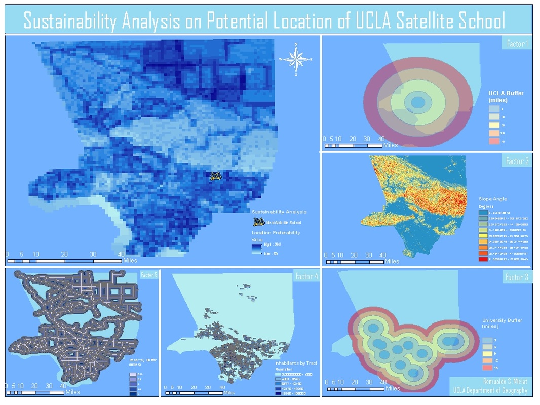
The hypothetical scenario exists: if the University of California, Los Angeles were to build a satellite school, where would it exist? I conducted a suitability analysis using GIS, based on five spatial factors with varying weights of importance.
I chose these factors based on how I believe the satellite school and the Los Angeles County will benefit economically and physically. The first factor are slope angles in surface terrain. It is physically unsuitable to build a school on a steeply inclined region. It would also require significant time, money, and resources to flatten the land. We find that the ideal location must be on a terrain that has little or no slope. The second factor is population. One of the main points of building a satellite school is to spread UCLA’s presence to the Los Angeles community. There are many underprivileged citizens who qualify for UCLA’s academic standard but can’t afford or access a lengthy commute. Putting UCLA in the center of a densely populated region will allow it to integrate within the city of Los Angeles more fully. If the UCLA satellite school is built outside of a populous region, it will only further isolate itself from the middle class, creating economic elitism. I briefly considered implementing median income data by census tract as a factor. However, a university’s academic reputation will not be affected based on how rich or poor the surrounding population is. The third factor the school’s proximity to freeways, highways, and arterials. UCLA’s satellite school would be more physically accessible if it was located close to major roadways. It would not deter any students who only have the means of public transportation for their commute. It would physically be more visible to the county as a whole. Guests would be more inclined to would be more if it was in a location centralized among roadways. The fourth factor is school’s proximity to other four-year universities within the Los Angeles County. We don’t want to locate the satellite school in a location that is too close to other universities, and instead focusing on areas without a college relatively close by. As we stated before, the goal of this project is not only to benefit UCLA’s influence, but also the region of Los Angeles County as a whole. The final factor is the satellites school’s proximity to UCLA.
To conduct the sustainability analysis, I gathered data and conducted individual analyses on the various factors. I had downloaded the 2012 Los Angeles County Boundaries and 2012 California Primary Roads from the Census Tiger website. I collected coordinate data for all major 4-year universities in the Los Angeles County, including UCLA. I also downloaded a DEM raster file of Los Angeles County from the United States Geological Survey website. To start off the analysis, I placed a multiple ring buffer on freeway data for increments of .25, .5, 1, 1.5, and 2 miles. I placed a multiple ring buffer around UCLA for increments of 10, 20, 30, 40, 100 miles. The last buffer is significantly larger to cover the entire Los Angeles shapefile for when we actually conduct the suitability analysis. I had also placed a multiple ring buffer around the other universities for increments of 3,6,9,12 and 100 miles. I had transformed the DEM file to symbolize slope levels across the county. I had symbolized the population of Los Angeles county by census tract. Next, I rasterized the vector shapefiles of the 3 buffer analyses and cloropleth map. Then, I reclassified each raster file, to have 5 classes with weights of the values 1,2,3,4, and 5. The more favorable the condition, the higher the value. For example, for the freeway multiple ring buffer, the 10 mile buffer would receive a value of 5, while the 2 mile buffer would receive a value of 1. Finally, I used the raster calculator spatial analyst tool to assign different weights to the factors. The equation I had used is as follows: Suitability Raster = (‘Slope’ * 20) + (‘Population’ * 18) + (‘Roadway’ * 17) + (‘Universities’ * 13) + (‘UCLA’ * 10). From there I clipped the new raster file to only show the LA county boundary. I symbolized it using a monochromatic blue color scheme with the most suitable regions symbolized in dark blue and the least optimal values symbolized in light blue. The output highlighted two regions were optimal for the UCLA satellite school, which was East Los Angles and the Lancaster/Palmdale region. I suggest the former simply because of its more relevant position.
GPS Collected Trees/Trails at the UCLA Mildred Mathias Botanical Gardens
Introduction:
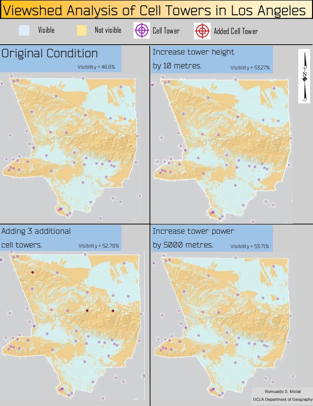
Buffer analysis is one of the most basic yet powerful operations performed on a GIS. It shows how features are related to other features in space. However, there are drawbacks in that the analysis doesn’t use elevation as a factor of measurement. Bringing in surface height into the picture is necessary when we are dealing with measuring the visibility of certain points. In my analysis, the visibility of cell phone towers frequencies to land surfaces are calculated in Los Angeles, while considering the surrounding terrain that might block the signals. This process is termed as viewshed analysis, and is a useful operation whenever dealing with buffering a feature when elevation is taken into account. This study helps determine how Los Angeles could maximize the signal efficiency of its cell phone towers. Hypothetically, the assignment calls for a viewshed analysis given a $30,000 budget to improve cell tower performance.
There provides us with three plans of action that I must compare. 1) Adding three additional towers at optimal locations that I select. 2) Increasing all the tower heights by 10 meters. 3) Increasing each tower’s power range by five kilometres.
Methodology:
To start, I clip a shapefile of the county of Los Angeles against a DEM file. This file will provide the elevation data that will determine the spread of each cell phone tower’s signal power. Second, I harvested cell phone tower location data from the Federal Communications Commission. I added several new fields to this excel table. OFFSETA consisted of how high each cell phone tower is. OFFSETB consists of how high is each feature that is being examined from the towers. Since, we are measuring visibility along the surface of the land, the default is left to 0. AZIMUTH1 determines what direction the cell phone towers start, having 0 face north and 180 face south. Since their signals are emitted in all directions from the source, I left the default at 0. AZIMUTH2 describes how far the tower’s signal emits clockwise from AZIMUTH2. I also left it at the default of 360 because the tower measures everything that within 360 degrees from the north. VERT1 and VERT2 measures the signal power on the z-axis, which we also both left at their default values. RADIUS1 measures how far on the horizontal plane must one go from the tower before a signal is sent. Since the signal is activated when it leaves the tower, the value set to 0. RADIUS2 measures the extent of the signal. For our purposes, it is estimated that cell phone towers have a range of 30 kilometres, thus we set all the values to 30,000 (meters).
This file consisted of all towers in the United States, so I selected and created a new layer with those towers in and around Los Angeles. I projected the towers as UTM Zone 11, which corresponded with the specific region I was analyzing for higher spatial accuracy. Next, I increased the spatial resolution of the dem file from 30 meters to 90 meters. This was because viewshed analysis uses a significant amount of processing power. Working with bigger pixels allow the operation to run faster, while having the output still appear the same. Finally, all the parameters are set, it’s time to start the viewshed analysis. This process is repeated three more times, with different variables shifting to reflect the conditions of our three options: 1) increasing tower height, 2) increasing tower power, 3) adding three new towers. To simulate these three conditions, I manipulated the respective fields in the excel table and repeated the viewshed analysis multiple times. To measure the effects of these transformations numerically, I had divided the number of visible units over the total amount of units projected onto the Los Angeles DEM.
Results:
After my projections, analysis, and calculations, I came to the conclusion that adding 5 kilometres of signal power to each tower resulted the most optimal solution in increasing efficiency, given our hypothetical conditions. The original layout of cell towers provided 53.27% visibility throughout the surface of Los Angeles. Increasing the cell phone tower heights by 10 metres increases visibility to 53.27%. Adding three new towers increased visibility to 52.78%. Adding 5 kilometres to the tower signal strength increases the visibility to 53.71%. Without viewshed analysis, we would not be able to get a real world representation of the signal power of the cell phone towers.
ArcGIS Toolbox w/ Scripts to Determine Closest Cities in Proximity to Lakes
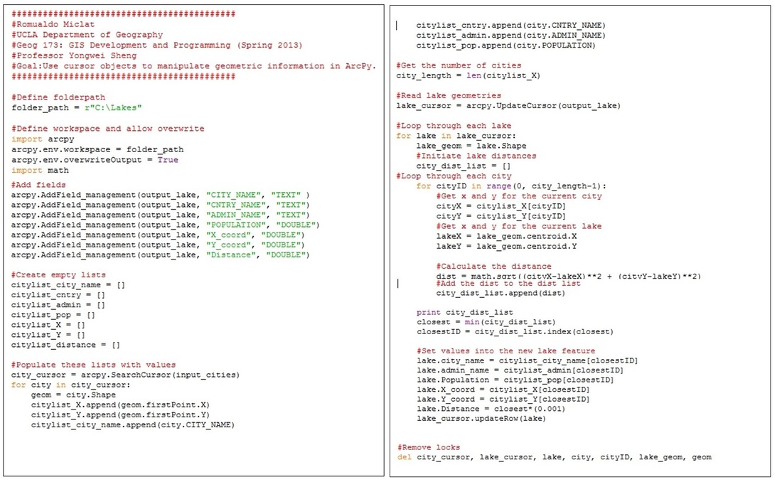
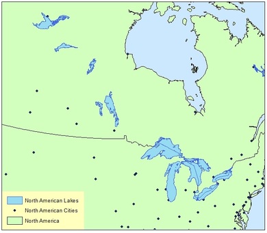
I developed an ArcGIS toolbox that has two Python scripts determining the closest city to either the centroid or the vertex of a lake. The user inputs in a shapefile with city point layer data and a shapefile with lake polygon data. The output is a duplicate copy of the lake polygon data, with information about the closest neighboring city for each lake added onto its attribute table. This script is dynamic in that any user parameters could be inputted as long as the characteristics are met. Download the tool box and accompanying sample lake shapefile data to process the script in ArcGIS. Put NA_Big_Lakes into the 'Input Lakes' parameter, place NA_Cities into the 'Input Cities" parameter, and 'Output Cities' parameter will decide where the new lake shapefile will be stored.
| LakeDistanceCalculator.tbx |
| LakeShapefile.zip |
Analysis
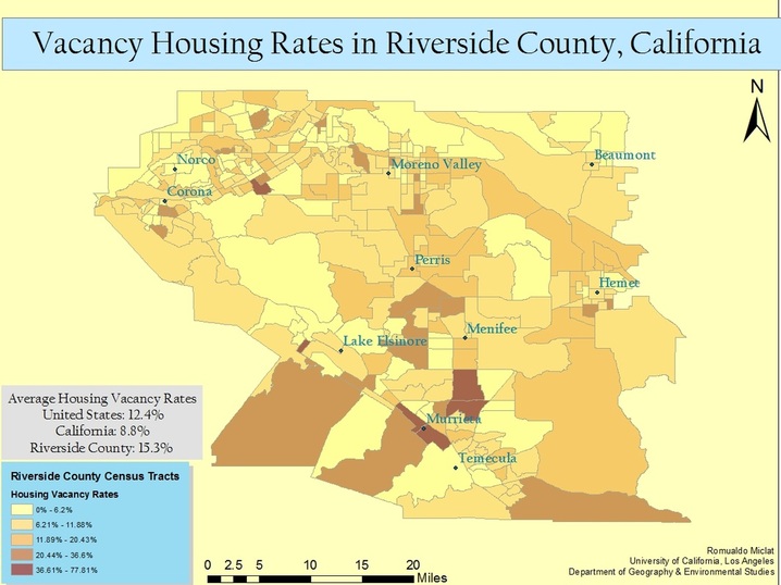
The recent recession has impacted all economies of scales (global, national, local). The housing market of Riverside County, California was hit significantly hard because of its newly developing suburban/urban environments. Vacancy rates are used as a metric to measure the economic demand for housing; these rates are not correlated to the monetary value of housing. This map spatially analyzes how the different regions of the county differ in terms of how many houses are vacant. Vacancy is defined as non-occupied houses for rent or foreclosed houses. I have compiled the vacancy rates for the census tracts of the Western region of Riverside County from the U.S. Census Factfinder (2007 - 2011 American Community Survey 5-year Estimate). The Eastern region was omitted because of the population represented was a significant minority over a vast expanse. Percentages of vacancy rates were symbolized using a jenks natural breaks classification, and were normalized against the total housing units for each census tract. The region around Murrieta/Temecula have a particularly high vacancy rate, probably due to their higher state of current development.
My family had moved into Riverside County, during 2005, right before the economic recession commenced. Many community members chose to invest in this region, primarily because it was a prime opportunity to acquire inexpensive housing in a region that was still developing. They expected business development to soar, in turn increasing housing values in the area. However, the onset of the recession prevented the urban growth that was once predicted and many investments backfired, thereby causing a number of foreclosures and lack of renters. This process, in turn, triggered fewer consumers to support local businesses, triggering a downhill, economic cycle. This map visualizes this phenomena in terms of uninhabited house development.
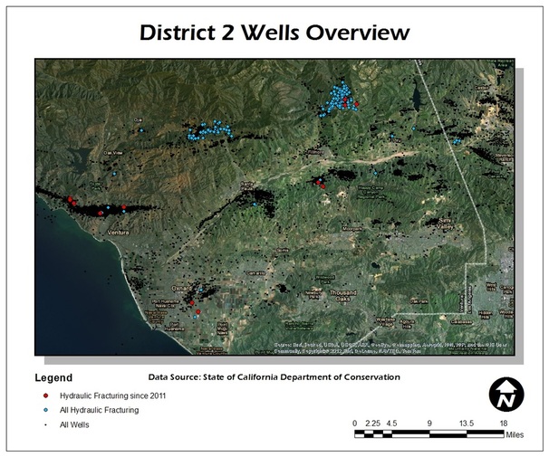
Ventura County Hydraulic Fracturing
UCLA Department of Geography
Authors: Romualdo Miclat, Michael Pulice
Advisor: Dr. Thomas Gillespie
Abstract: A remote sensing/GIS analysis on the environmental implications of hydraulic fracturing in Ventura County, California.
Full Project Blog: http://venturafrack.blogspot.com/
Authors: Romualdo Miclat, Michael Pulice
Advisor: Dr. Thomas Gillespie
Abstract: A remote sensing/GIS analysis on the environmental implications of hydraulic fracturing in Ventura County, California.
Full Project Blog: http://venturafrack.blogspot.com/